Learn how to interpret your pinterest analytics (i.e. impressions, outbound clicks, audience insights, and top pins) so you can use Pinterest strategically to grow your email list, increase template sales, and generate client inquiries.
If you’re a web designer, brand designer, or template shop owner, chances are you’ve used Pinterest for inspiration long before you ever considered it a marketing channel.
And maybe over time, you started noticing something…
Traffic.
Old blog posts resurfacing. Template pages getting saved. Random pins quietly sending clicks.
So you open Pinterest Analytics and see impressions rising, monthly views fluctuating, and a few saves scattered throughout.
And you wonder:
Is this actually helping my business?
Here’s the truth. Pinterest Analytics is not there to impress you with big numbers. It exists to show you what’s driving traffic, what’s resonating visually, and what’s actually moving people toward your offers.
In this updated 2026 guide, I’ll walk you through the key Pinterest analytics reports and show you how to interpret them through the lens of a creative business so you can stop guessing and start building intentional growth.
The Two Pinterest Reports That Matter
Pinterest gives you a lot of data, but as a website or brand designer, you really only need to focus on two reports to start:
Analytics Overview — how your content is performing
Audience Insights — who your content is attracting
If you have your Pinterest Tag or Conversions API installed, you may also see a Conversion Insights report (currently in beta). This report connects Pinterest activity to revenue, checkouts, and average order value. It’s powerful, but it requires accurate tag setup to be meaningful. For more information, visit the Pinterest tag setup guide.
For now, we’ll focus on mastering the two foundational pinterest analytics reports.
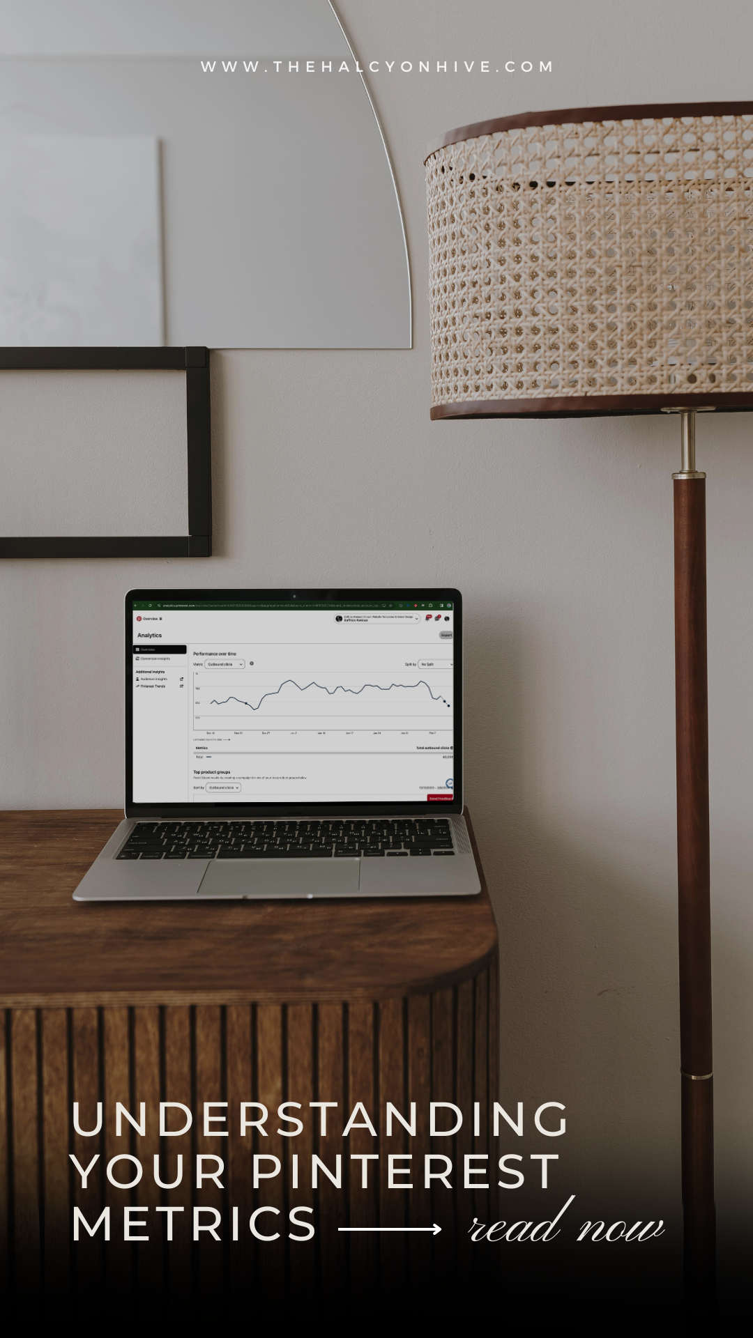
Part 1: Analytics Overview

Step 1: Set Your Filters
Before you analyze anything, you’ll want to set your filters.
Your data only means something within context. Looking at random date ranges or mixed traffic types can quickly get overwhelming. Start with the basics:
Date Range: Choose any of the pre-selected timeframes or set a custom range. I recommend reviewing the last 30 days for regular monthly analysis, or selecting the previous full month when you sit down for a structured review. This allows you to compare month-over-month trends instead of reacting emotionally to short-term fluctuations.
Content Type: If you are not running ads, keep this set to organic. If you are running ads, review organic and paid performance separately so you can understand what is driving results without blending the two.
When to Use “More Filters”
From here, this is where I take a slightly different approach than most tutorials.
I do not spend much time toggling the overall “More Filters” section each month. Instead, I rely primarily on the Performance Over Time chart with it’s drop-down menu of metrics and “Split By” options to analyze trends and diagnose performance.
The global “More Filters” options are best treated as diagnostic tools when looking at individual pins or boards, rather than default settings.
Use them when you have a specific question, such as:
- What are the top pins that get engagement for desktop or mobile?
- Are other saved Pins generating more engagement than my own?
- What content or pin style is driving engagement on my account?
For example, isolating your claimed domain can help you confirm that your website is driving meaningful traffic, not just third-party Pins. Filtering by device can reveal whether your audience behaves differently on desktop versus mobile, which may influence landing page design or launch strategy.
But these filters are not something you need to adjust constantly. Your goal is to ask a focused question and use filters only when they help you answer it.
For ongoing monthly reviews, the Performance Over Time chart will give you far more strategic insight than repeatedly toggling reporting filters.

Step 2: Overall Performance – Your Snapshot
At the top of the Analytics Overview page, you’ll see your core performance metrics. Think of this row as your monthly dashboard. It’s a quick snapshot of how your account performed within the selected date range and filters.
These are the numbers I track each month to understand long-term growth.
Impressions (Visibility)
Impressions show how often your pins show up in a feed or search results. They indicate distribution, not action. Someone could’ve been scrolling through the discovery feed or their search results and they rolled right past your pin. No click, no save, no engagement whatsoever, but it still counts as an impression since it was served to them on screen.
For a web or brand designer, impressions tell you:
- Pinterest is surfacing your design style
- Your keywords are being indexed
- Your templates or designs are appearing in search
Visibility is important. But visibility alone does not equal revenue. If impressions rise, Pinterest is distributing your content. If they dip, that’s normal. Seasonality and search behavior fluctuate throughout the year.
Impressions answer the question: Is Pinterest showing my content?
Engagements (Interest)
Engagements include pin clicks, saves, and outbound clicks. This metric tells you whether your content stopped the scroll. If impressions are high but engagements are low, your content may be visible but not compelling. If both are rising together, you’re building momentum.
Engagement answers the question: Is my content resonating?
Outbound Clicks (Traffic)
Outbound clicks measure how many people actually clicked through to your website.
For template shops and service providers, this is one of the most important numbers on the dashboard. Traffic fuels email growth, shop sales, and client inquiries.
If impressions are increasing but outbound clicks are flat, your content may be too inspirational and not action-driven.
Outbound clicks answer the question: Is Pinterest sending traffic to my business?
Saves (Intent)
Saves send a strong engagement signal to Pinterest. This shows that people are interested in your pin/content but don’t necessarily need it right now. It tells the algorithm to show them more pins like this.
TIP: Select “Saves” from the drop-down menu at the “Top Pins” section in your Pinterest analytics. Click on a few of your top pins, then click “See More Stats” up at the top. Take a look at boards people are pinning it to. If they are relevant boards (aka your target audience) that’s great! See what other types of content they are pinning to give you ideas for new content.
If saves are high but clicks are low, your content may be inspiring rather than action-driven. That’s not necessarily bad — but it tells you something about buying intent.
Saves answer the question: Is my content worth bookmarking?
Total Audience vs Engaged Audience
Total audience shows how many unique users saw or interacted with your content. Engaged audience shows how many actually took action. This comparison helps you evaluate alignment, not just reach.
To find your account’s engagement rate, take the engaged audience number, divide by the total audience number, then multiply by 100 to get the percentage.
What is a good Engagement rate to have? Most B2B accounts on Pinterest are somewhere around a 1-2% so if yours is higher, that means your visuals are aligned, your messaging is clear, and you are attracting the right audience.
These numbers give you a snapshot, but don’t tell the whole story. To understand whether your strategy is compounding over time, you need to zoom out and look at Performance Over Time.
Step 3: Performance Over Time – Look for Patterns
The Performance Over Time chart is where Pinterest becomes strategic.
Instead of only focusing on the static dashboard metrics, use the Performance Over Time chart to look for trends or patterns. At the top left of the chart, you can toggle between different metrics. Choose one metric at a time and study its trajectory. You may also want to look at different date ranges on here to see a bigger picture.
(TIP: Hit the plus sign to select a second metric to view. I like to look at Impressions + Engagements here to see how their growth or decline are related.)

Start with Impressions
Impressions tell you whether Pinterest is distributing your content.
Ask yourself:
- Is reach steadily increasing?
- Are there consistent upward trends over time?
- Did a spike correlate with a launch or fresh content?
If impressions are flat or declining long-term, that may signal inconsistency, weak keyword alignment, or lack of fresh Pins.
Switch to Outbound Clicks
Outbound clicks tell you whether your content is actually sending traffic to your business.
Now ask:
- Are clicks rising alongside impressions?
- Do spikes in impressions also result in traffic spikes?
- Are certain periods converting visibility into action?
If impressions rise but outbound clicks remain flat, your content may be visible but not compelling enough to drive action.
Toggle to Outbound Click Rate (CTR)
CTR shows alignment.
It measures how effectively your visual, title, and keyword work together. For creative brands, a healthy CTR typically falls between:
- 0.3–0.6% (healthy)
- 0.7%+ (strong)
- 1%+ (excellent alignment)
Questions you may want to ask here:
- Is my CTR improving over time?
- Does CTR spike when I test new design styles?
- Are my impressions increasing but CTR declining?
If CTR drops while impressions rise, your messaging may not match search intent.
CTR answers the question: Are the right people clicking?
Review Engagement Rate or Saves When Testing Content
If you’re experimenting with new design styles, formats, or keyword angles, toggle to:
- Engagement rate
- Saves
Ask:
- Is this style resonating?
- Are people bookmarking this content?
- Is this more inspirational or action-driven?
This is especially useful when validating new product angles.
Using “Split By” to Diagnose Performance
Now use the Split By dropdown to get even more specific answers. This is where you move from observation to diagnosis.

Claimed Accounts
If you sell templates or digital products, this is one of the most valuable splits.
Ask:
- Is my primary website domain generating the majority of impressions and clicks?
- Are third-party Pins outperforming my own?
- Is Instagram driving engagement but not traffic?
If “Other Pins” dominate, it may mean your visuals are being reshared. That’s good for reach, but you want your website driving meaningful traffic.
Source
Ask:
- Is engagement coming from my own Pins or others?
- Are certain boards driving stronger distribution?
This can reveal whether your content is spreading beyond your own boards.
Think in Trends, Not Snapshots
The chart helps you zoom out. Instead of reacting to a single day’s dip, look at the overall direction over weeks or months. Spikes often correlate with:
- Fresh content
- Launch periods
- Seasonal search behavior
- Keyword alignment
- Backend updates on Pinterest (out of our control)
Dips are normal. What matters is trajectory. Pinterest rewards consistency, and this chart shows you whether your strategy is compounding over time.
As you look at the graph, take note of what days you see more impressions or engagements. Did you implement any new strategies? These are things you want to take note of for reference later on.
Step 4: Top Product Groups (For Template Shops)
If you have a product catalog connected to Pinterest, you’ll see a section for Top Product Groups beneath the Performance Over Time chart.

This view shows which product collections or categories are generating the most impressions, engagement, and clicks.
For template shop owners, this is valuable insight.
Ask yourself:
- Which product categories are consistently driving traffic?
- Are certain template styles outperforming others?
- Do launch periods correlate with spikes in specific product groups?
If one product group consistently outperforms the rest, that may signal strong keyword alignment, demand, or visual resonance. It can also guide future product development, promotions, or ad strategy.
Step 5: Top Pins — Your Built-In Market Research
Under the “Top Pins” you will find a goldmine of information.

I will filter my pins by “All Pins” or choose to look at one of my claimed domains. These settings can be changed in the “More Filters” section as we did in the beginning. Use the drop-down menu to look at the different metrics (engagements, impressions, etc.). What themes do you see in your pins? Look at the pin design itself as well as the title and description. Is there a dark overlay with light text? Or is it an overall light colored pin? What keywords are you using? Take note of this when thinking of new content to create.
If you see you have a ton of close-ups on your pins, but saves or clicks are low, consider adding a call-to-action (CTA) on the pin and in your description.
As a designer, pay attention to:
- Color palettes that perform
- Overlay styles (minimal vs bold)
- Keyword phrases that consistently show up in your top performers
- CTA clarity
If pin clicks are high but outbound clicks are low, your visual is compelling but your call to action may be unclear. Designers often under-communicate outcomes. Pinterest analytics isn’t just traffic data. It can be visual research for your next product or launch.
Step 6: Top Boards
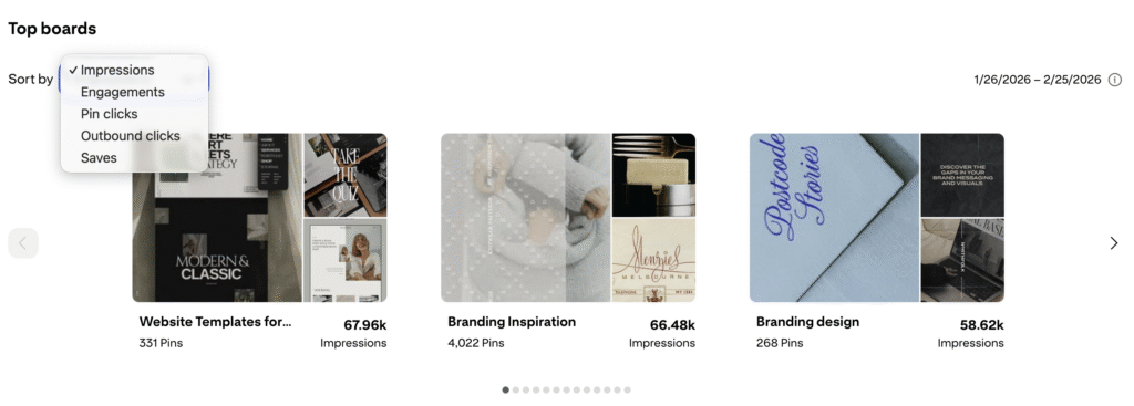
In the “Top Boards” section, I look at the impressions and engagements of my boards to see which boards are getting the most reach and performing best. When I create a new pin and want to schedule it to multiple boards, I will pin it to the most-relevant, top-ranked board of mine. Board performance reveals what topics your audience consistently responds to and where you may want to expand.
Step 7: Individual Pin Stats
One last thing I like to look at from time to time is my individual pin stats. Click on any of your pins to open it in a new window.

Next, click on “See more stats” and take a look at the history of your pin. Look at the 30, 60, or 180 day date range to see when a pin may have spiked. If it’s an older Pin that has started to pick up in reach and engagement, consider creating new variations or expanding that topic into a new blog post or product angle.

Below the graph, you’ll see boards that people are saving your pin to. Are they appropriate for what your pin is about? If not, then how can you give more context to the pin? Maybe use a different image or try a text overlay on it. If it is on a relevant board, check out the person who pinned it. It is likely they could be your target audience.

Part II: Audience Insights – Are You Attracting the Right People?
If Analytics Overview tells you what your content is doing, Audience Insights tells you who it’s attracting. And for designers and template shop owners, that distinction matters. High impressions mean nothing if the wrong audience is engaging.

Affinity: The Alignment Indicator
Pinterest sorts categories by Affinity, which measures how strongly your audience is interested in a topic compared to the average Pinterest user. If the category with the highest affinity is aligned with your niche, then you have built and attracted the right audience here on Pinterest. If it doesn’t, then it probably means you have boards that are unrelated to your niche (i.e. recipe boards but you are a web designer) and that is the content people are engaging with.
You may notice some of the categories may seem like they don’t align, but here’s the truth. If you see Finance as a top category, are you using keywords around “Building a business” or “Creating a passive income steam”? These keywords fall into the “Finance” category so they are not necessarily off-base. You may see other out-of-place categories, but remember Pinterest looks at the images of pins to help index them too. Do you use mockups of laptops or cell phones on your pins? Then you should have a higher affinity in the electronics or home decor category.
Are You Attracting the Right Audience?
For web and brand designers, it’s a good idea to review your audience insights to check positioning.
If your top categories are “Fashion” or “Recipes,” but you sell Showit templates (and don’t use topics things in your pin designs), it’s a signal you may have some boards that are diluting your audience.
Pinterest distributes your content based on engagement signals. If your non-business boards attract interaction, that is the audience Pinterest will continue to show your content to.
You don’t just want engagement — you want alignment.
What to Do If Your Audience Is Off
If you notice misalignment:
- Move unrelated boards to secret
- Separate personal content from business content
- Create more Pins aligned with your ideal client’s search behavior
TIP: Move any boards that are unrelated to your niche to secret so you can still access them. OR better yet, keep a personal account for your non-business content. Focus on creating and pinning to a variety of boards relating to what your ideal audience would be searching for.
When your audience aligns with your niche:
- Your outbound click rate improves
- Your saves become more strategic
- Your traffic converts more consistently
It takes time to curate your ideal audience so I will generally only look at my audience insights once every month or even once a quarter. If you’re building passive income through digital products, audience clarity matters more than reach. The right 10,000 viewers will outperform the wrong 100,000.
How Often Should Designers Review Analytics?
I recommend reviewing your Pinterest analytics on a consistent rhythm so you’re making strategic decisions and not just flying by the seat of your pants each month when you pin.
- Do a monthly deep dive into your traffic and outbound click rate (CTR) to understand what’s actually driving clicks. Is Pinterest traffic increasing to your website?
- Once a quarter, review your audience insights to make sure you’re attracting the right people — especially if you sell templates or digital products.
- And during launches, take a quick weekly glance at your top-performing pins so you can spot what’s gaining traction and double down while momentum is building.
Pinterest Rewards Intentional Strategy
Pinterest is not a platform you win with random effort. It rewards consistency, clarity, and iteration.
When you understand what is getting seen, what is getting clicked, who is engaging, and how that traffic behaves inside your funnel, Pinterest stops feeling unpredictable. It becomes measurable, repeatable, and most importantly, it compounds.
For creative businesses and template shops, this is where Pinterest shifts from an extra marketing channel to sustainable traffic source.
Pinterest brings the traffic.
Strategy turns it into growth.
If you want help translating your analytics into a strategy that drives real conversions, explore my Pinterest strategy services.

This post may contains affiliate links, meaning that if you choose to click through and make a purchase, I will receive a small commission at no cost to you.
Leave a Reply


close
with code: CYBER20
Cyber week sale!
let's shop!
Take 20% off your purchase
Offer valid through 11:59pm CST on 12/02/2024
Promo code (if applicable) must be entered at checkout. Cannot be combined with other codes or used on the Pinterest Template Bundle. Not valid on previous purchases. Not responsible for forgotten or misused promo codes. Offer subject to change

I’m just starting out with Pinterest marketing and I had no idea you could access individual pin statistics too! This will be super helpful moving forward. Thanks for the tip!!
So glad you found it helpful! I’m happy to answer any other questions you might have!